 |
|
 May 12, 2011, 02:45 PM // 14:45
|
#1021 |
|
Furnace Stoker
Join Date: Dec 2006
Guild: [Bone]
Profession: Mo/
|
Crazy. And very cool idea with the smoke. You'll go a long way
|

|

|
 May 12, 2011, 03:24 PM // 15:24
|
#1022 |
|
Academy Page
Join Date: Jan 2006
Guild: Black Widow / House Palomides
Profession: Mo/E
|
The Citadel = stunning work, maybe you could join ANet's concept team

|

|

|
 May 13, 2011, 11:50 AM // 11:50
|
#1023 | ||
|
not so much fell as.....
Join Date: Jan 2009
Location: UK
Guild: bone
Profession: R/
|
The executioner is great – I want one, I just wouldn’t know where to put it ^^
Quote:
Quote:
When you said sea creature I was hoping for more than just a head. But 2 days – really is that all? The quotes from your teachers are interesting, I am so glad to hear that they appreciate your talent. Do let us know what happens in the final critiques. |
||

|

|
 May 13, 2011, 04:40 PM // 16:40
|
#1024 |
|
Desert Nomad
Join Date: Apr 2009
Guild: Trifecta Luminati [TRI]
Profession: W/
|
The thing is so big, that I don't even know where to put it. Sits at 10" tall and 14.5" wide - not really a coffee table kind of piece.
Yeah, the serpent head above is the sea creature I previously mentioned. I originally was thinking of making kind of a giant worm rising out of the sink with open maws, but the deadline totally killed that dream. Not this Thursday, but the one before that was when the deadline was set to the 12th. So that only left that Thursday and the next Tuesday to work on it. That in mind, I had to settle for something way more simple. Too much work in my illustration classes to dedicate another 48+ hours in the ceramics studio. Anyways, I'll try to get some final pictures up next Tuesday for you since my critique was pushed back until then. But just for fun, have some line-art for an illustration project a number of weeks back. First real comic book theme and styled work - still have yet to take a picture of the colored versions: 
Last edited by Charlie Dayman; May 13, 2011 at 04:57 PM // 16:57.. |

|

|
 May 13, 2011, 07:47 PM // 19:47
|
#1025 |
|
Furnace Stoker
Join Date: Jan 2009
Guild: [SOTA]
Profession: D/
|
Na na na na na na na naaaa Batman!
You are so good at jumping between different art styles. |

|

|
 May 16, 2011, 12:03 AM // 00:03
|
#1026 |
|
Desert Nomad
Join Date: Apr 2009
Guild: Trifecta Luminati [TRI]
Profession: W/
|
@V: The cartoon style is starting to grow on me, I have to admit.
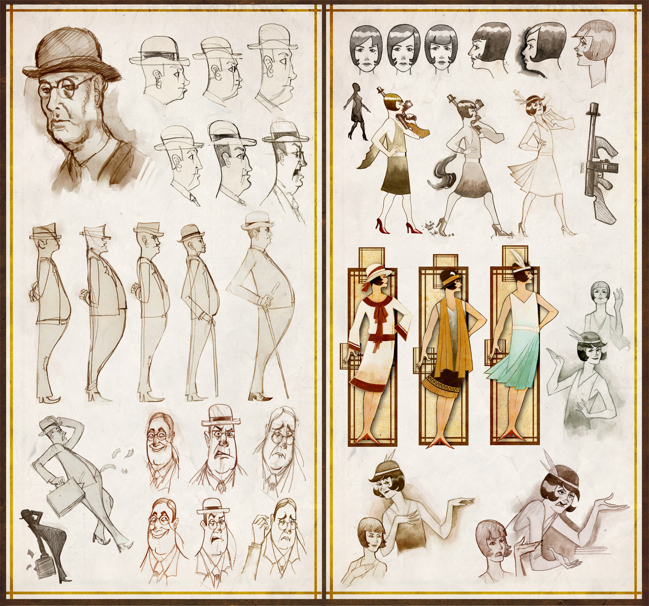
Dropping one of three 18x24" development boards for anyone interested in Character Design. Gives you an idea of the things you go through to develop a scene or characters. 
|

|

|
 May 16, 2011, 09:05 PM // 21:05
|
#1027 |
|
not so much fell as.....
Join Date: Jan 2009
Location: UK
Guild: bone
Profession: R/
|
wow Charlie, I would never have realised you started out with that scene.
Its amazing how it chnages. One question though....why did the emerald city get less green? I can't see the font so well on my screen but aren't you missing an 'e' from Sergio Leone? |

|

|
 May 16, 2011, 09:27 PM // 21:27
|
#1028 | |
|
Desert Nomad
Join Date: Apr 2009
Guild: Trifecta Luminati [TRI]
Profession: W/
|
Quote:
That, and I like using color shifts instead of colors right in your face. |
|

|

|
 May 16, 2011, 10:03 PM // 22:03
|
#1029 |
|
Wilds Pathfinder
Join Date: Sep 2009
Guild: ...
Profession: W/
|
seriously. you're just ridiculous
|

|

|
 May 17, 2011, 05:23 PM // 17:23
|
#1030 |
|
Wilds Pathfinder
Join Date: Aug 2007
Location: Wisconsin
Guild: Cerberus Guardians of the [GATE]
Profession: E/
|
id like to +1 shy guy!
i love your cartoony style <333 |

|

|
 May 17, 2011, 05:59 PM // 17:59
|
#1031 |
|
Jungle Guide
Join Date: Jan 2007
Location: The Netherlands
Guild: None
Profession: R/
|
Yeah, I don't even know how to comment on those anymore.
|

|

|
 May 18, 2011, 01:31 AM // 01:31
|
#1032 |
|
Desert Nomad
Join Date: Apr 2009
Guild: Trifecta Luminati [TRI]
Profession: W/
|
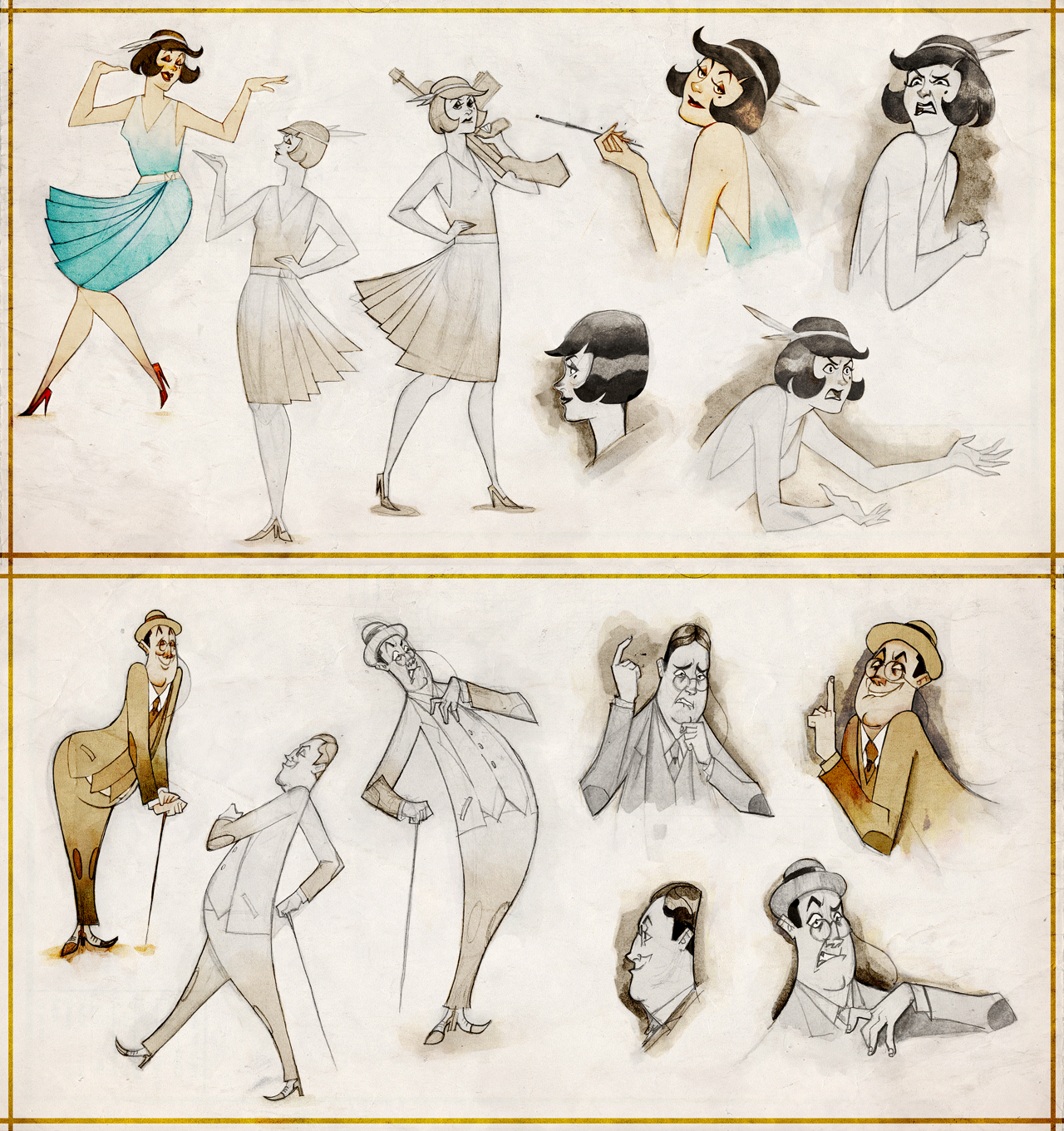
I'm posting these more as a brief overview of what goes into designing characters, and potential ideas that others can use as help. I'll try to post more in-depth summaries later - still rushing to finish my illustration final now.
Development sheet showing the initial concepts and pre-finalized designs. You can see in the first steps of both characters, I was still stuck in a realistic style. Took a good amount of time and fighting to finally let go and analyze things more in simple shape than anatomical structure.  Final expressions and poses. 
Last edited by Charlie Dayman; May 18, 2011 at 01:44 AM // 01:44.. |

|

|
 May 18, 2011, 03:37 AM // 03:37
|
#1033 |
|
Jungle Guide
Join Date: Apr 2009
Guild: Eon
Profession: Me/N
|
Damn Charlie, stop rendering people speechless!!!!!!!!!!
|

|

|
 May 18, 2011, 08:02 AM // 08:02
|
#1034 |
|
Site Contributor
Join Date: Mar 2008
Location: UK/norway
Guild: Order Of The Etherbloom Crown [ZEN]
|
can't stop lol'ing at Patches' expression in the coloured rendition at the far right. these development sheets are a lot of fun, I was hoping you'd post something like this, or an overview of the project of sorts. Smells like an A to me.

|

|

|
 May 18, 2011, 08:43 AM // 08:43
|
#1035 |
|
Furnace Stoker
Join Date: Dec 2006
Guild: [Bone]
Profession: Mo/
|
Those expressions are really really really good. Words come short, seriously. Top right 2 expressions of the second image are my winners <3
|

|

|
 May 19, 2011, 02:18 AM // 02:18
|
#1036 |
|
Jungle Guide
Join Date: Jul 2009
Guild: The Kurzick Mob [Mob]
Profession: R/
|
There are only two words to describe this
|

|

|
 May 19, 2011, 08:04 PM // 20:04
|
#1037 |
|
not so much fell as.....
Join Date: Jan 2009
Location: UK
Guild: bone
Profession: R/
|
I have no idea what you did there but it is horrible ^^
which two words, Hide Spoiler? |

|

|
 May 20, 2011, 12:05 AM // 00:05
|
#1038 |
|
Jungle Guide
Join Date: Jul 2009
Guild: The Kurzick Mob [Mob]
Profession: R/
|
Its the "Me Gusta" face, which apparently means "I Like"
So it is indeed a compliment... or is intended to be one 
|

|

|
 May 20, 2011, 06:58 PM // 18:58
|
#1039 |
|
Desert Nomad
Join Date: Apr 2009
Guild: Trifecta Luminati [TRI]
Profession: W/
|
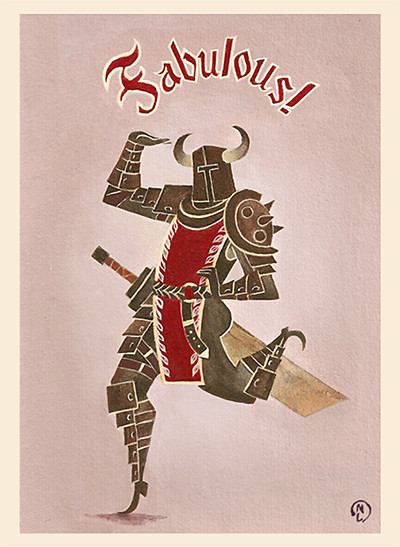
Finals are overrrrrrrrrr - so tired. Here's something while I'm dead for the next 14 hours asleep. Acrylic painting with a bit of recoloring in Shoop.
 Now I actually have time to sift through everyone's threads and see what they're working on. |

|

|
 May 20, 2011, 07:41 PM // 19:41
|
#1040 |
|
Furnace Stoker
Join Date: Dec 2006
Guild: [Bone]
Profession: Mo/
|
Simply brilliant. Welcome back to life.
|

|

|
 |
|
«
Previous Thread
|
Next Thread
»
| Thread Tools | |
| Display Modes | |
|
|
All times are GMT. The time now is 01:16 AM // 01:16.


 Linear Mode


